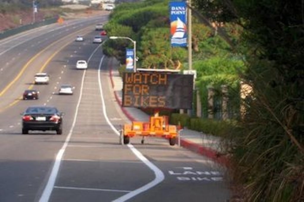
The problem is that humans are not Xerox machines and we don’t read by a direct line moving ahead of us, but instead we focus on objects. If the “LANE | BIKE” sign were separated by fifty feet it would be logical, as each line would be its own distinct object, but by having them so close it actually inhibits attribution.


Lots of markings on roads follow this pattern. I think the logic is that the closer (bottom) text comes into focus first.
But yeah, when you look at it, it just looks backwards
The problem is that humans are not Xerox machines and we don’t read by a direct line moving ahead of us, but instead we focus on objects. If the “LANE | BIKE” sign were separated by fifty feet it would be logical, as each line would be its own distinct object, but by having them so close it actually inhibits attribution.
I would argue that as soon as that’s the case and letters have to be spread far and wide, a sign might be more appropriate.
I mean, I didn’t even notice it was written backwards until these comments, so obviously some of us have already learned to read it that way.